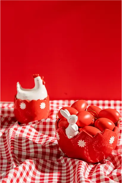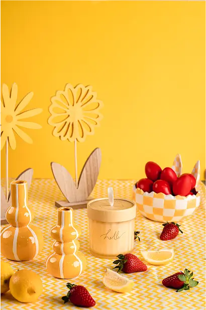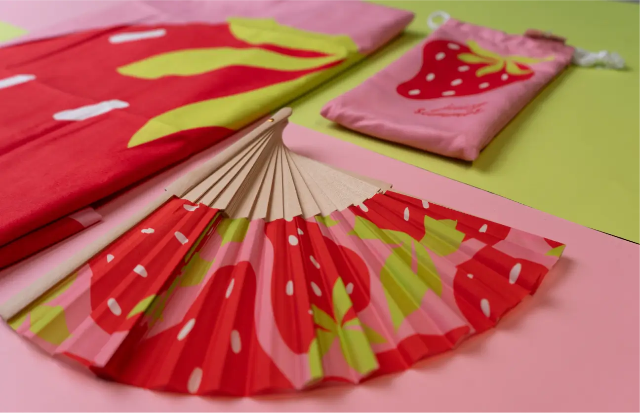

A bold new chapter for Greece’s most colorful retail brand.
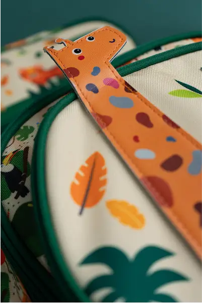
We redesigned MAXSTORES with one goal in mind: to capture the playfulness, accessibility, and endless creativity of a brand that lives inside every school bag, office drawer, and gift box.
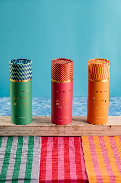
From logotype to packaging, every element was built to feel bright, fun, and ready to explore.
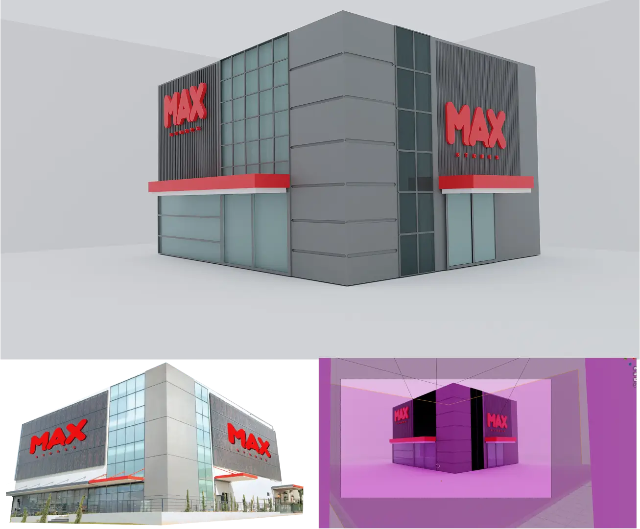
We set out to create a brand identity that could organize variety without flattening character. One that could feel instantly joyful, yet unmistakably structured. By developing a bold visual system rooted in color, rhythm, and flexibility, we shaped a brand experience as fun, familiar, and ever-evolving as MAX — across stationery, decor, lifestyle, and beyond.

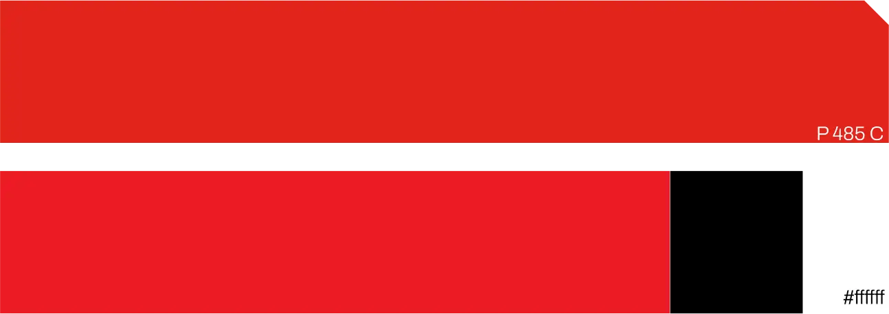
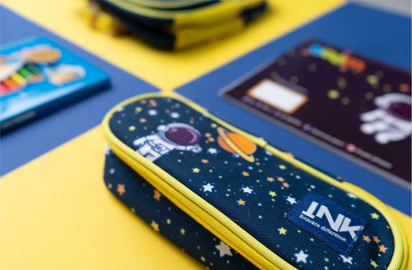
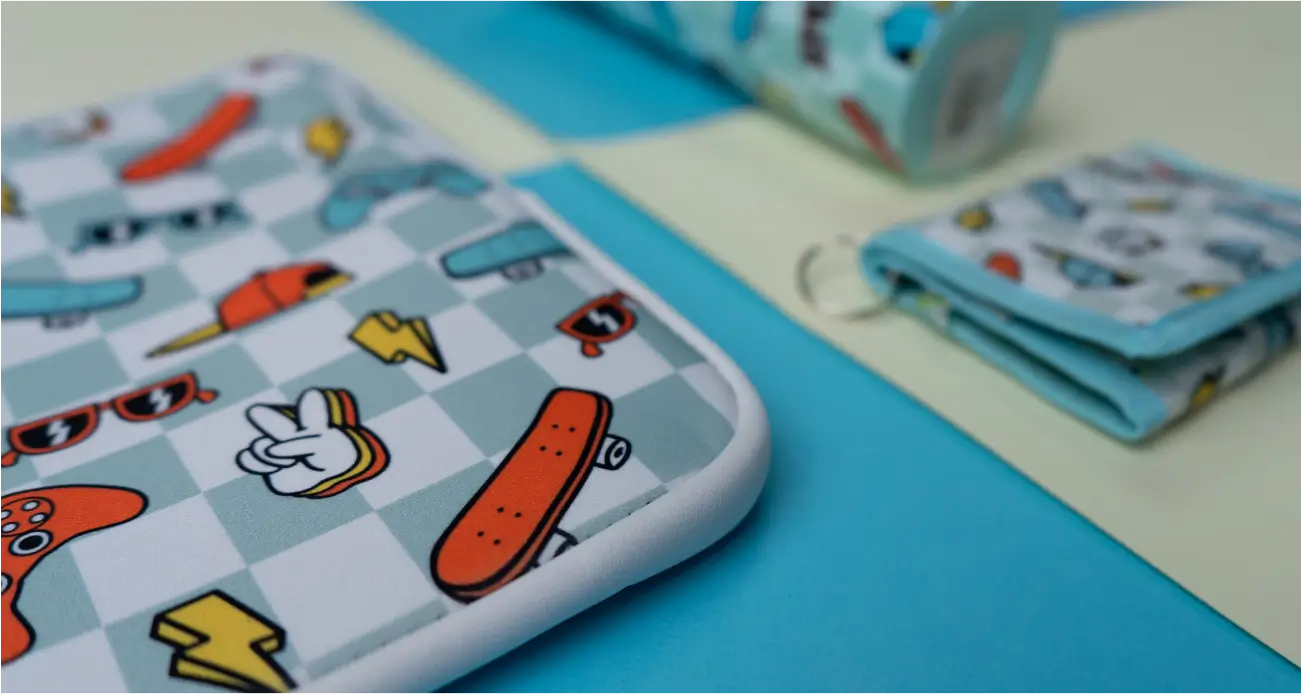
MAXSTORES offers hundreds of SKUs. Our job was to unify this chaos into a bold, recognizable system that adds structure without taking away the fun. Through vibrant color palettes, clean iconography, and joyful layouts, we brought clarity, identity, and shelf appeal, without losing cohesion.


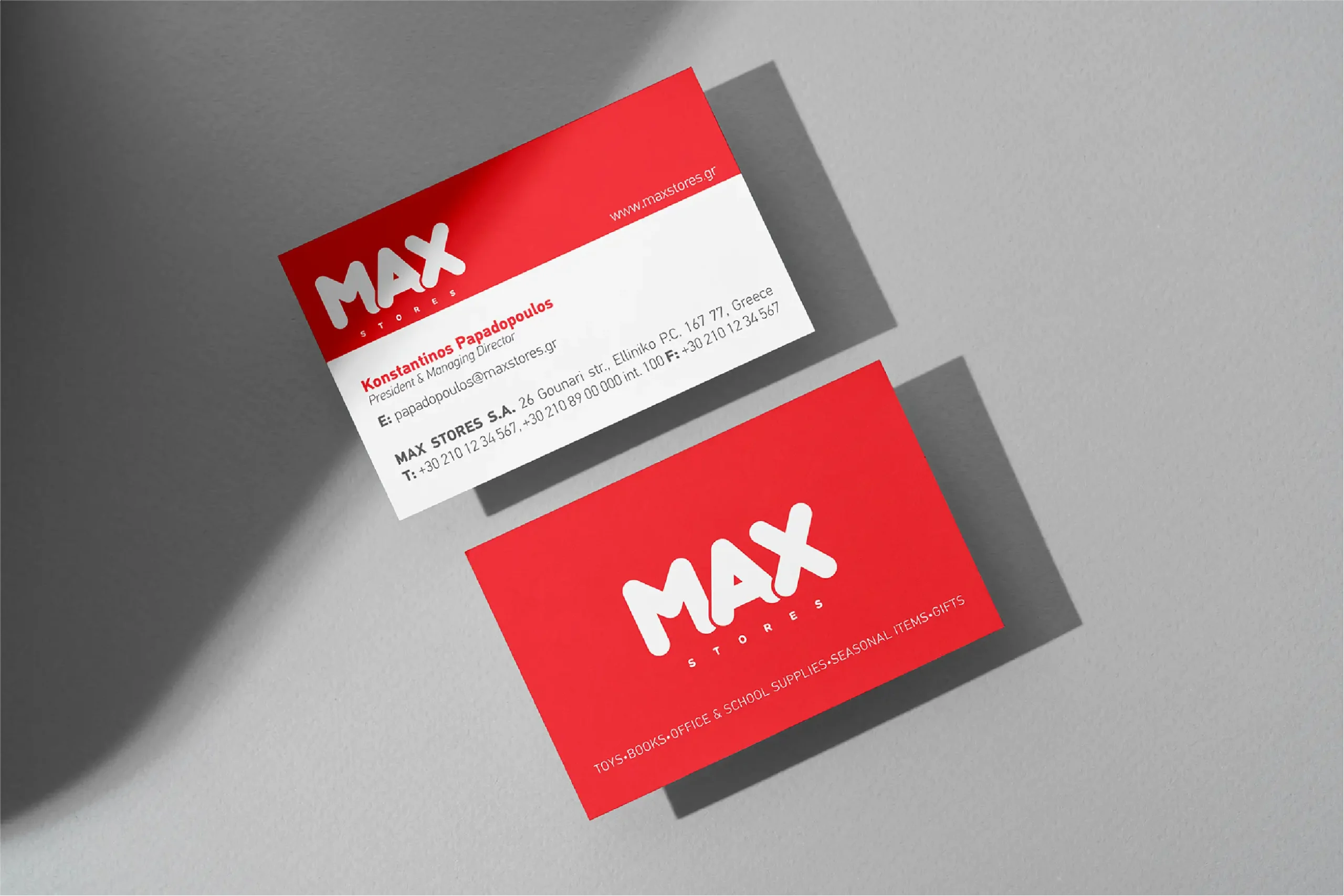
More than just bold visuals, this is design that captures attention, invites interaction, and builds instant recognition — right where it matters most: on the shelf.
For MAXSTORES, we didn’t just design packaging. We built an entire brand universe from the ground up — covering every product line, every private label, and every visual touchpoint.
From stationery to homeware and lifestyle goods, we crafted a system where each item feels playful and distinct. Because in a world of visual noise, great design doesn’t just fit in — it stands out.
