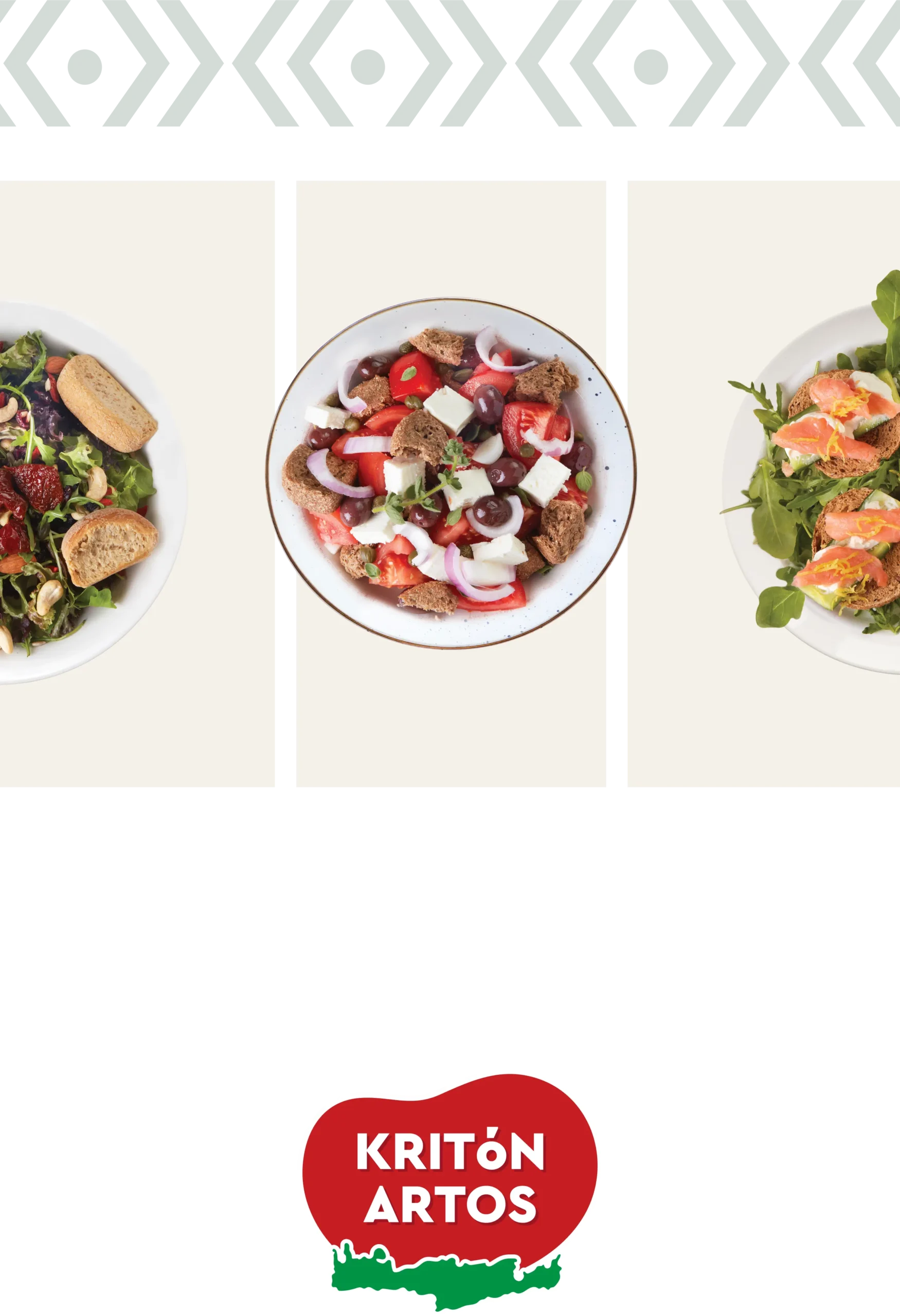
Tradition that rises. Identity that lasts.
For the iconic Cretan bakery brand, we created a bold and instantly recognizable identity that blends the warmth of tradition with a fresh, contemporary feel. Grounded in the island’s roots and inspired by its honest flavors, this branding pays tribute to heritage—while looking firmly ahead.
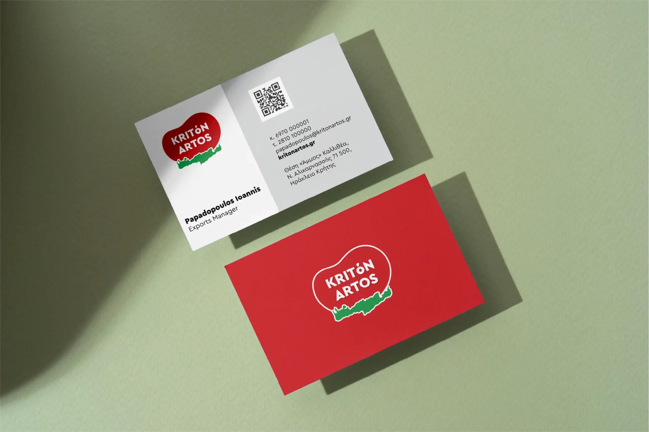
Our mission was to reimagine a heritage-driven brand through a contemporary lens—without losing the essence of its origin. The goal was to create a visual identity that could honor tradition, feel instantly recognizable, and connect emotionally with both loyal and new audiences. By balancing timeless elements with bold simplicity, we managed to craft a logo system that reflects the values, roots, and vision of a bakery born in Crete and built on trust.

The visual identity draws power from a rich and meaningful color palette. The deep red evokes warmth, passion, and the handmade quality of traditional baking. In contrast, the vibrant green symbolizes freshness, growth, and the fertile land of Crete—bringing to life the natural origin of the brand. Together, these colors form a striking balance between heritage and vitality, creating a timeless aesthetic that feels both familiar and bold.

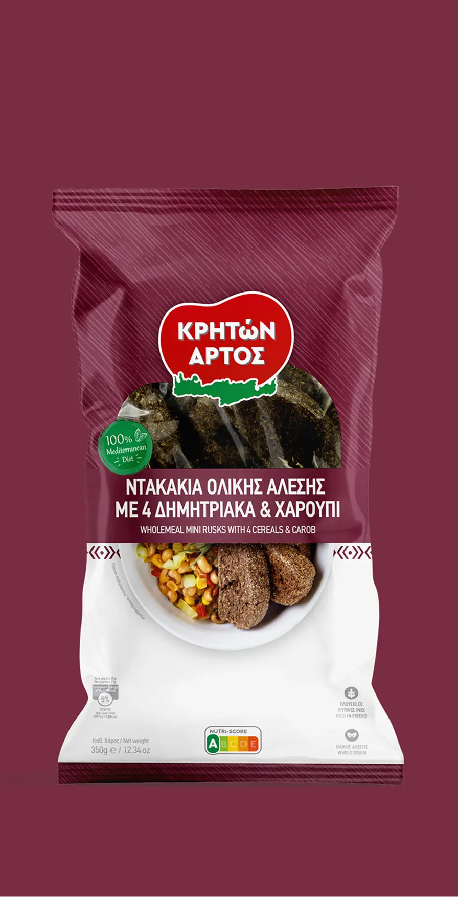

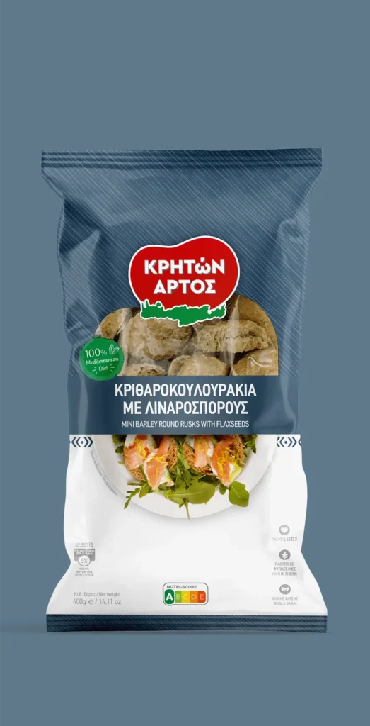
A clean form meets authentic storytelling.
For Kriton Artos, we developed a packaging system that captures the essence of the brand—minimal, grounded, and full of soul. Every element was designed with purpose: to reflect the honesty of the ingredients, the purity of the origin, and the quiet confidence of a brand that doesn’t need to shout to stand out.

The visual language is understated yet powerful, allowing each product to speak for itself—on shelf and beyond. This thoughtful approach earned us recognition at the Packaging Awards 2024, celebrating design that is as meaningful as it is beautiful.