Positioning relief where it matters most.
We were entrusted with the full creative direction for Depon Plus — a new combination formula by VIAN S.A., designed to target migraine and tension headache symptoms with precision.From strategy and messaging to design and retail presence, we developed a 360° campaign built around the product’s double-action promise and fast relief positioning.
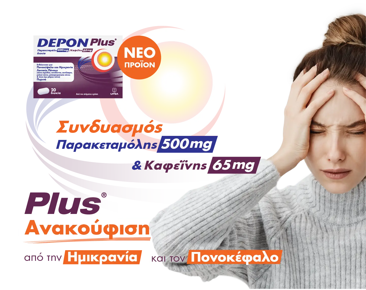
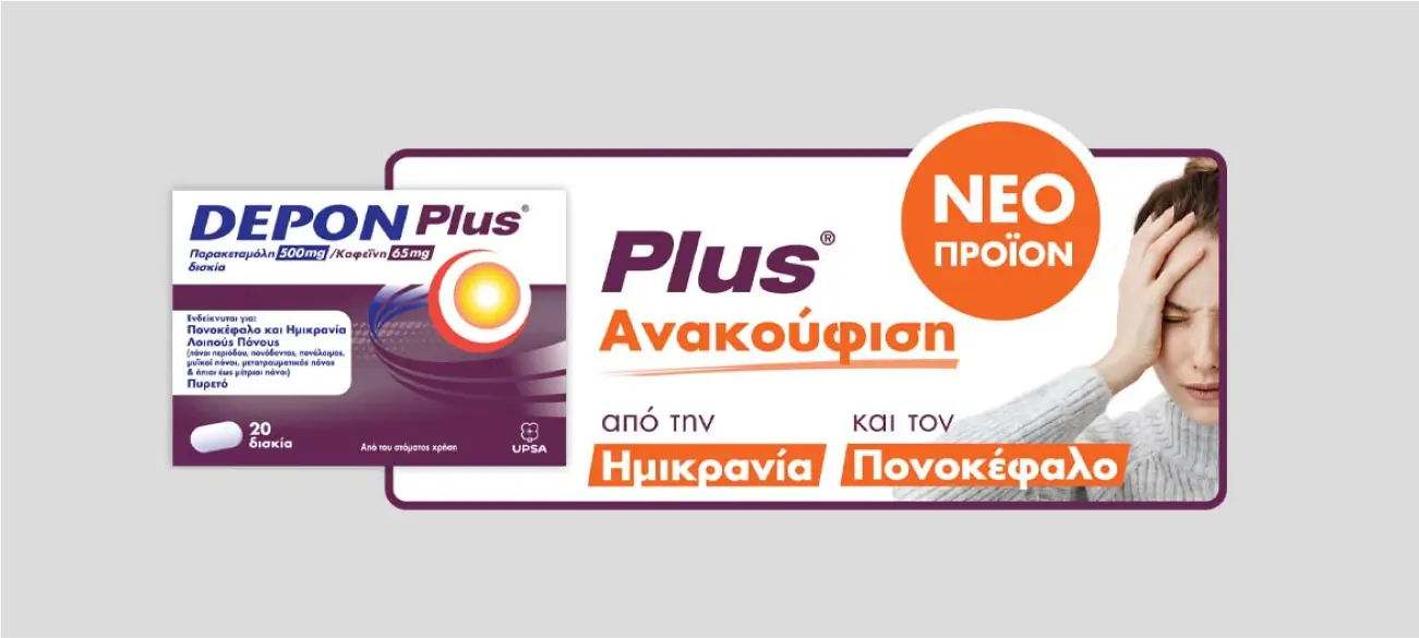
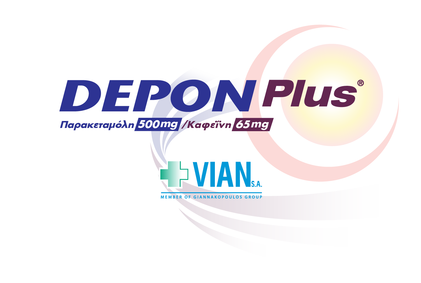
The visual identity of Depon Plus highlights both ingredients — Paracetamol & Caffeine — in a structured, high-contrast system that builds immediate trust and clarity. We paired pharmaceutical accuracy with approachable visuals and clear, benefit-first messaging.
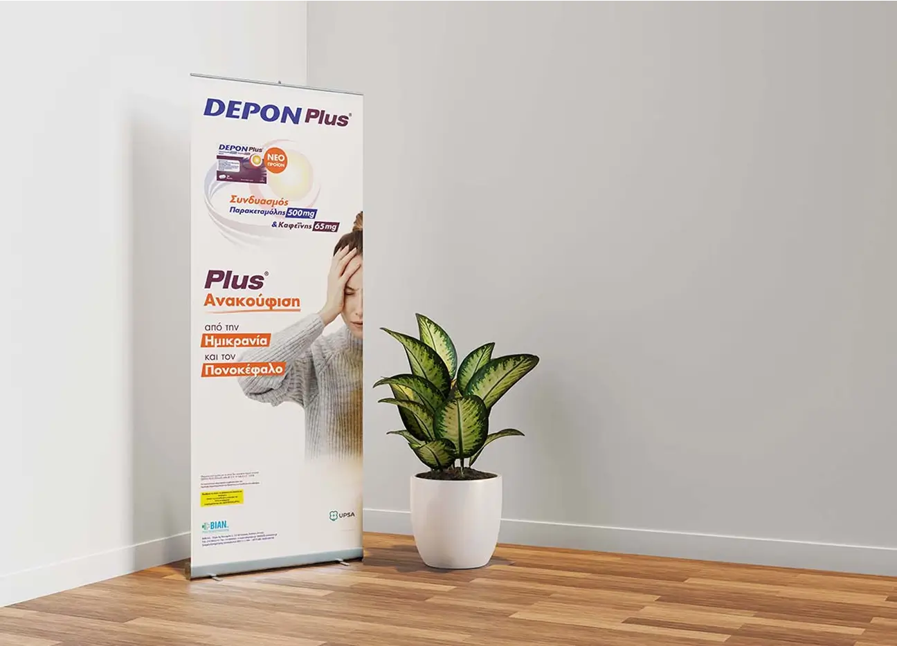
We designed a full suite of POP materials to bring Depon Plus to life in real pharmacy environments — from vertical floor units to counter displays and info-based shelf systems.Each stand was crafted to reflect the brand’s tone: direct, precise, and purpose-driven.
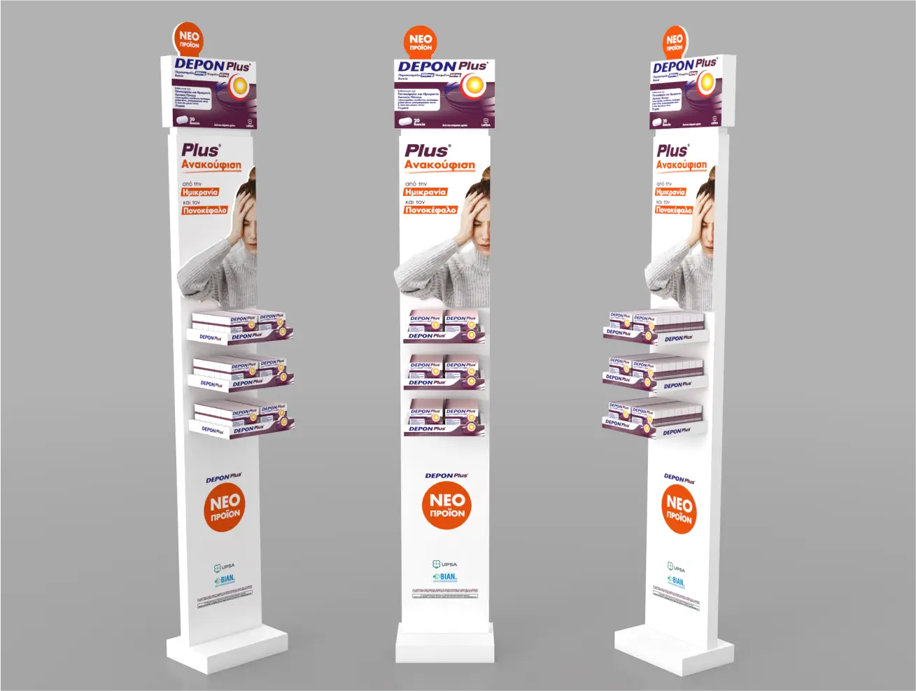
Placement and perception go hand in hand — and every visual touchpoint was built to support product clarity and professional trust at pharmacy level. Depon Plus required a system that communicates clearly — fast. Our job was to deliver that through form, color, and message.
The Depon Plus campaign was built around impact — visual, verbal, and strategic.From the first glance to the pharmacy shelf, every element works together to deliver a message that’s immediate, structured, and relevant.
A product made for double-action relief needed a design that speaks just as directly. We made sure it does.
Χρησιμοποιούμε cookies για τη σωστή λειτουργία του website, την ανάλυση επισκεψιμότητας και τη βελτίωση των διαφημιστικών ενεργειών μας. Μπορείτε να αποδεχτείτε όλα τα cookies, να τα απορρίψετε ή να προσαρμόσετε τις επιλογές σας. Πολιτική Απορρήτου